Team Paragon Production Bible
Art Director, Environment Lead - Katerina Arrington
Vehicle Art Lead - Frank Aliberti
Art Co-Producer, Graphics Programmer - John Hughes
Producer - Eric Lynum
Table of Contents
Project Overview
Introduction
The purpose of the document is to guide our team towards a unified vision for the visual look and feel of our game. In addition to the art standards we have a section here regarding our team tools and how they could be utilized. Following this guide will help ensure the success of our game and communication amongst teammates!
Game Pillars
The purpose of the game pillars is to define what our game really relies on and that, if the pillar is taken away, the game would not be the same. The pillars will also be used as a tool for measurement whenever new features are being considered to be added to the game. The pillars are ranked, and any new features get evaluated in that order. Any features that are considered, will pass if they do not conflict with any of the pillars.
The Game pillars are as follows:
The Game pillars are as follows:
- Living Mythic Sci-fi Visual Style
- Boosting Until You Explode
- Competitive Multiplayer
- Rollercoaster Tracks
- Risk vs. Reward Turning
- Exciting Airtime
For additional information on the game pillars, such as each pillar’s definition, refer to the “Pillars” document in our google drive account.
Tools Overview
Overview
The following tools will help bring out the best of our team via the team skills
and help speed up iteration
Tech tools
SVN Tutorial
SVN will be the method of choice for our team to be used to share
resources. This includes all models, textures, PSD, audio files.
Art Pipeline
Our game engine is constantly evolving so make sure to ask during our team meetings and John in regards to the state of the graphics engine and its capabilities. We currently support hot-swapping of textures and models via our CRex exporter application which runs in the background while you have the game running along with Maya x64 2013 and Photoshop.
Team Tools
Clear definitions of Vocabulary
It is important that communication between all members on the team exist and the best way to ensure this is by clearly defining vocabulary used whenever used. Make sure that the speaker and listener are on the same page in regards to which definition is referred by. This is especially important when working across the various disciplines that our team consists of. An example is that a programmer may refer to “layers” and “filters” interchangeably whereas an artists marks a clear distinction between the two terms.
Active Listening
Active listening happens when one person paraphrases what they
understood the other person said. This ensures that the listener understood exactly the message that the speaker intended. Reply with “What I’m hearing is this ____”.
Myers Briggs
The Myers-Briggs types help understand the behavior and motivations of the members of the team. Though nothing is definite, this will help establish an understanding for one another on the team as a team tool and not a replacement for getting to know one another.
Stomping:
As you will see between introverted and extroverted individuals (Is and Es, respectively), one person may “stomp” another by not allowing the other person a time to jump into the conversation to state their opinions.
Whenever you feel that you are being “stomped” by someone when you are trying to get a part in the conversation, raise your hand and the one talking will give the person a turn once finished. This plays to vital when everyone has something to say.
Myers Briggs Resources
Short Test:
The following link provides with a bare minimum test to figure
out the Myers-Briggs type that you are.
Extensive Test:
http://www.humanmetrics.com/cgi-win/jtypes2.asp
It is highly suggested if time permits, that you take this extensive test for a more accurate reading of your Myers-Briggs type.
Personality Types:
The Following Link helps bring an understanding of what your
type means as well as better understand the members of our team.
Team Meetings
Check-Ins
Purpose of check-ins are to notify the group of your state. This is the most
direct and concise way for us to communicate, especially in a team of this size.
Note that everything mentioned below is crucial and that it gives each
speaker a full turn in order to express their current state to the team.
- I feel (mad/happy/sad/glad). Physical/mental state
- You can expand to state specifics such as things causing these emotions.
- I’m in/out
- When in the team replies with “welcome” in order to acknowledge what you said.
- When out the team replies with “Thank You” for the member’s notification that they will not be able to make stay for the meeting.
Task Scheduling
Tasks will be given out with weekly deadlines, it is expected that the days scheduled to come in to work is used for these tasks and they will be completed on time. If for some reason this is n
- Expected availability for this week on how blocked you will be this coming week (ex: I have 3 projects due this week and I will be out of town Wed-Fri)
- Tasks
Show and Tell
- Use 8.5 x 11 for paper standard and print out multiple copies to show share your concept with everyone.
- There will be a standard for format of our concepts, including logo/fonts used/ size/color in order to create a unified set of assets.
- Format in PNG and also upload the PSDs alongside them
Art Project Overview
As a member of Team Paragon, time management in order to be able to work towards making a successful game will be key. Although we understand that you may have obstacles like school work, a job, or personal issues, we do need you to contribute to the team regular basis and make it to your scheduled team times. This game will be the key portfolio piece for us all, and it should be treated as such. If you are feeling overwhelmed and are unable to meet a deadline or team work session, please let Nawid know as soon as possible.
We also expect that you do a majority of the work for the game in the team space on campus. It’s really important that we have constant communication and it also raises team morale to work closely together. Productivity is also best this way because if anyone is blocked or has a problem/question, it can be resolved immediately.
And lastly, we expect you to have fun! Everyone on the team is super excited about the game and really enjoy working on creating something beautiful and fun!
Production Requirements
Concept
The purpose of concepting is so that we are all on the same page for the look and feel of the game. It’s also to put ideas onto paper, a faster way than to try and model it and hoping it works. Anyone can concept something to illustrate their idea, not just artists. That’s the point of concept.
Concept should always start with thumbnails but eventually we will need a finished piece to help solidify the idea, as well as orthographic views to assist the modeling process.
Polish levels:
First pass - Silhouettes, rough thumbs, abstract shapes.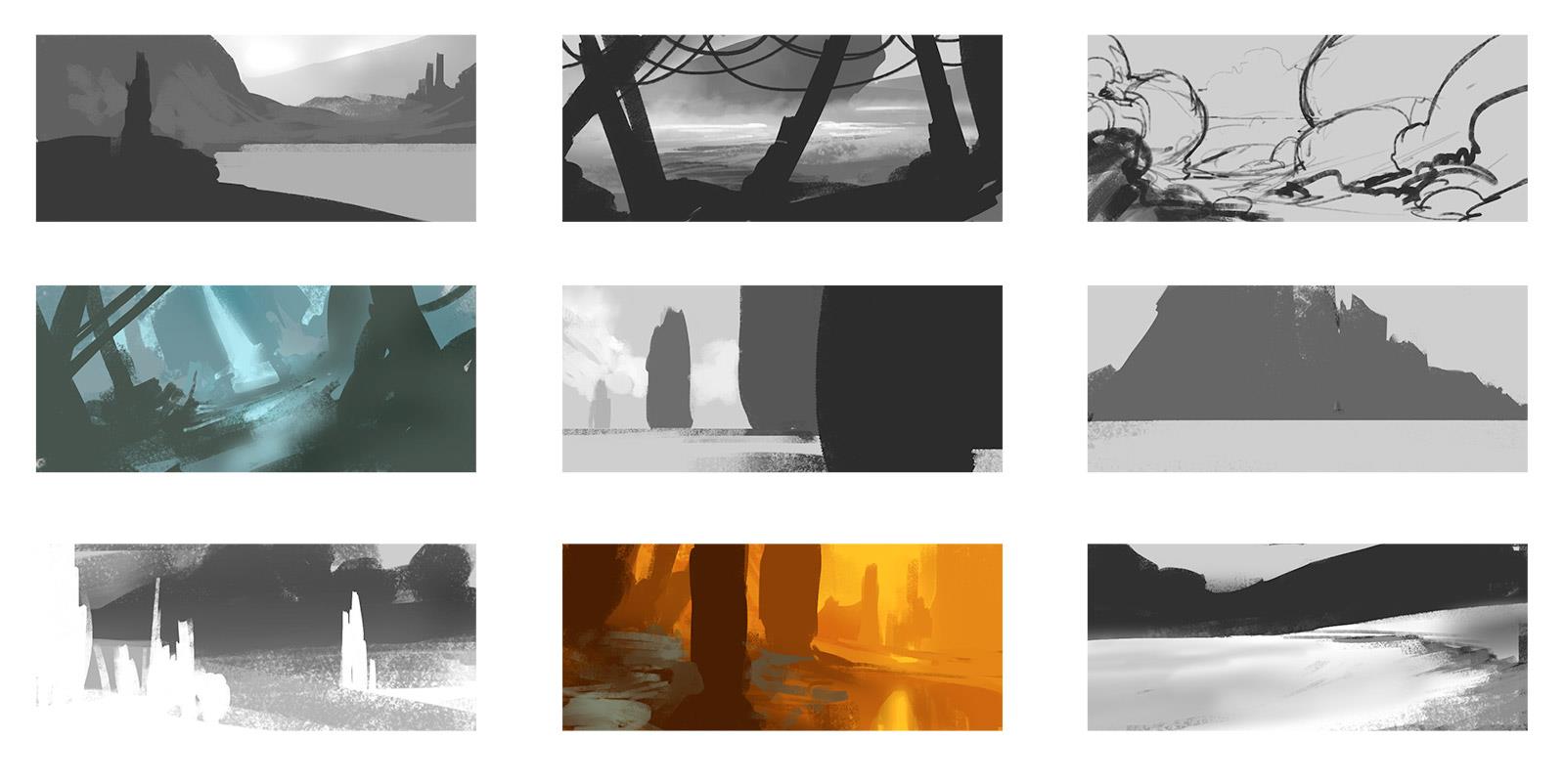
Second pass - Slightly more detailed, things that were abstract are now readable, color is given some thought.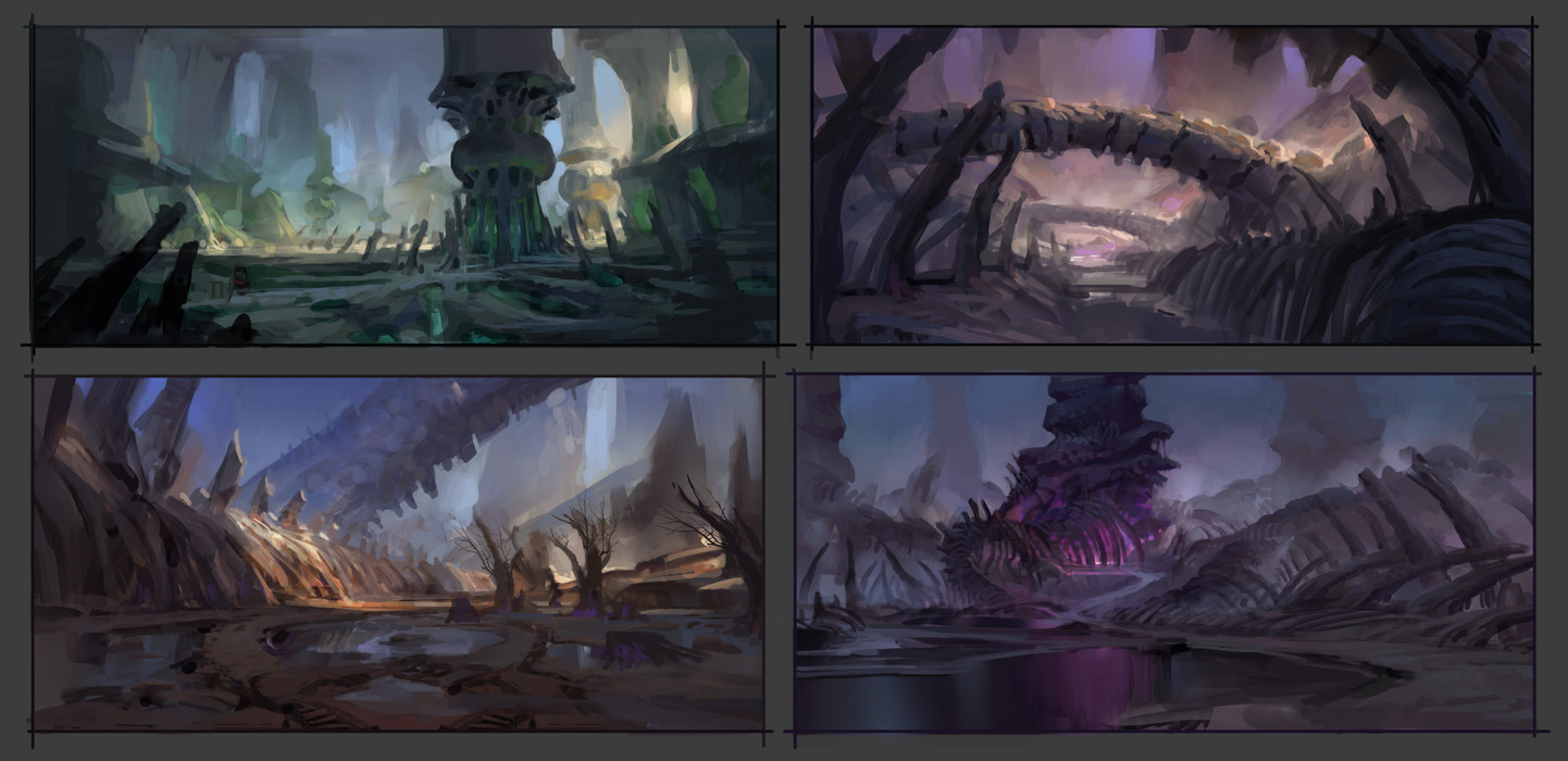
Final pass - Solidify anything that was unclear from second pass or reiteration on areas that did not match style. Does not have to be ultra detailed, just needs to reflect what everyone agreed upon. Not all artwork will be taken to final pass if second pass is clear enough.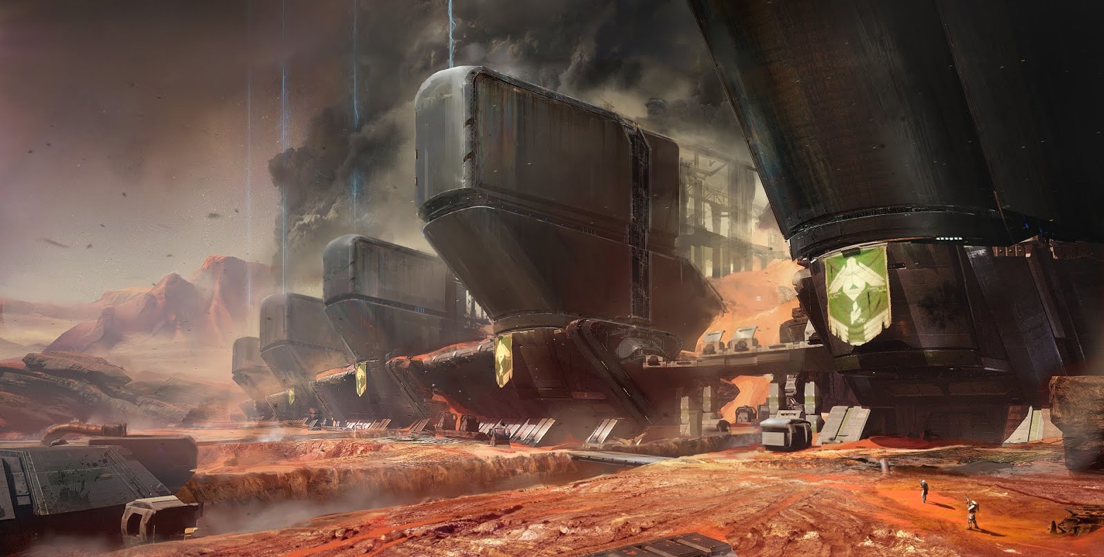
Things to keep in mind:
- Concepts should be submitted as PNG.
- You should include the PSD file so that other artists can easily go in and make changes to illustrate their idea.
- Please follow the reference below as to how you should label your concept:
Model
We’ll be using Maya 2013 for all of our low poly modeling purposes. Our high poly and normal mapping software choice is still to be determined.
The level of detail we will be aiming for will be roughly like the wipeout racers: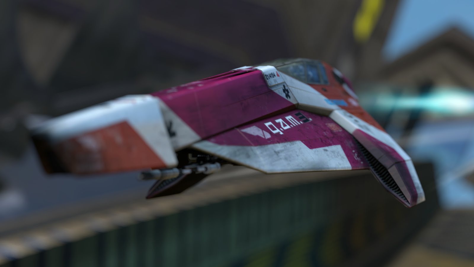
Some differences is that we are not going to model out every rivet in the air intake and other miniscule details that we will probably use normals for.
Polish levels:
Placeholder - Correct box size to be place in game.
First pass - Blocked out undetailed pieces. Perhaps 20 - 50 % of poly count.
Second pass - 80% poly count.
Final pass - 100% poly count.
Things to keep in mind:
- Models should be saved as .mb file.
- You should always submit the Zbrush or high poly mesh file that you generated the normals from.
Texture
When creating textures, the primary software used will be Photoshop. We will also be creating spec maps that will also use Photoshop. Ways to submit is still to be determined.
Things to keep in mind:
- Maps should be saved as .png.
- You should always submit the PSD files of all maps so that iteration can be done easily.
Polish Level:
First pass - Local color.
Second pass - Ambient occlusion, wear and tear details.
Final pass - Finished details
Submissions
File Naming Conventions
TypeofFile_Material_Usage_Name_00.extex. M_Rock_Prop_Pillar_00.mbif textureTypeofFile_Material_Usage_Name_00_Typeoftexture.extex. M_Rock_Prop_Pillar_00_N.mb
Art Guide
1. Look and Feel
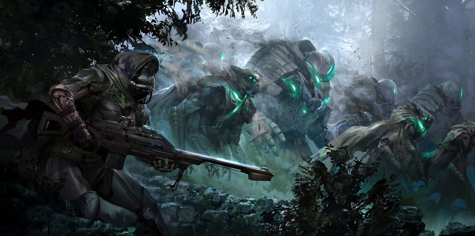
We’ve decided that this game will be a Destiny inspired racer thus Destiny is our primary look and feel reference. However, to describe that in words, we want a gritty sci-fi that has some fantasy elements. What is important is that there is a dichotomy in some kind of aspect, whether it is in the shape, color and material. 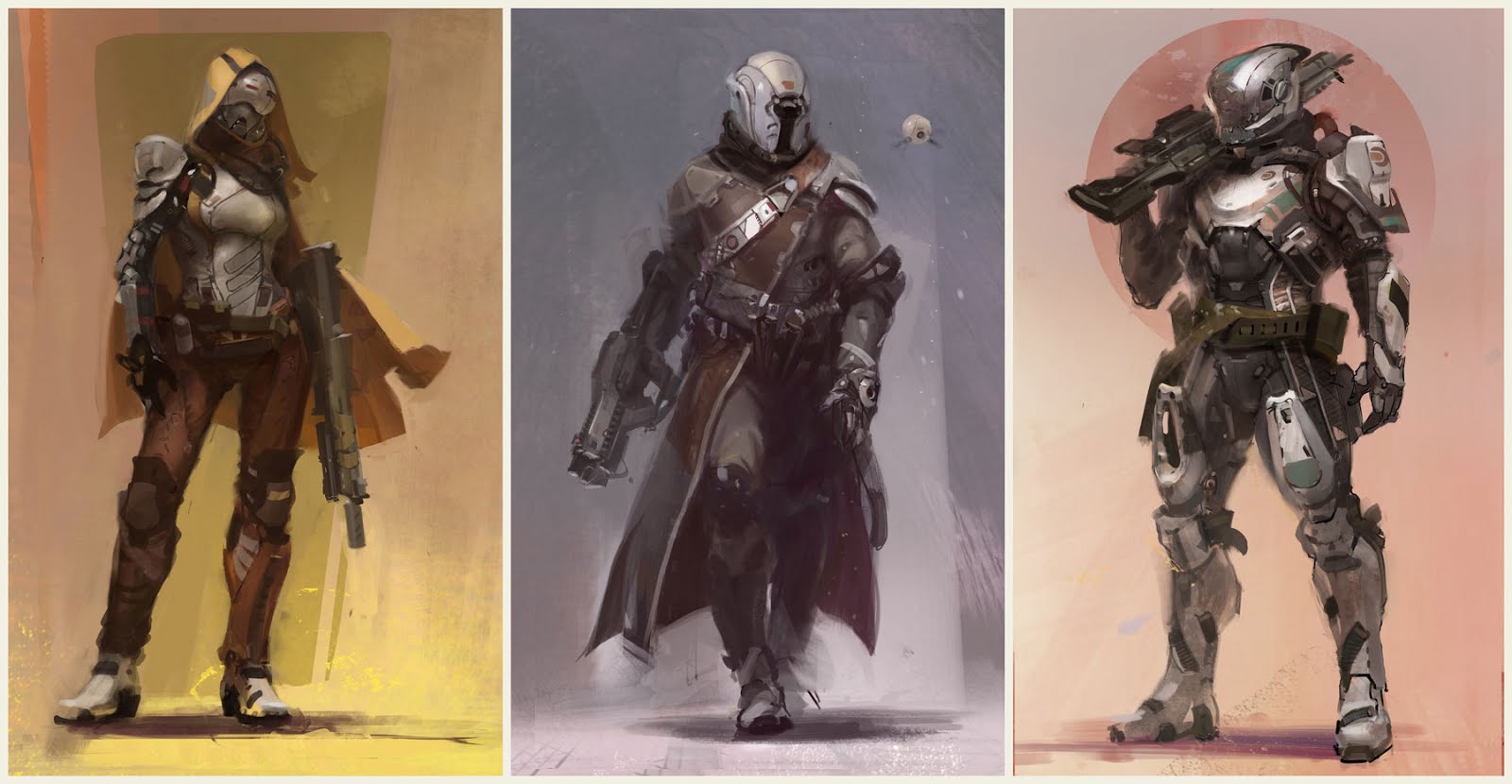
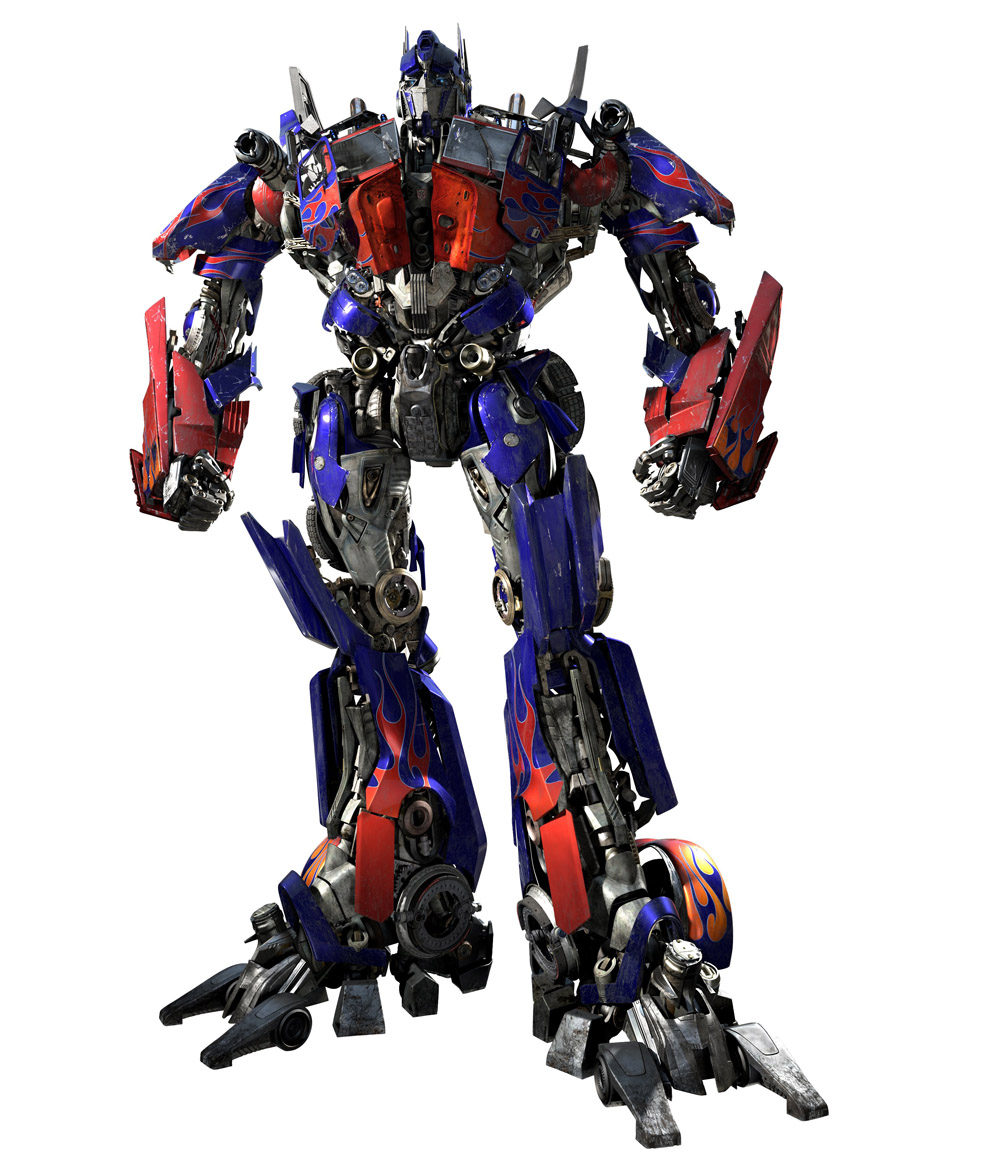
Although we aren’t doing characters, I thought this is a good image to portray what we are going for. Sci-fi can easily look forced and convoluted. Artists that aren’t careful will start placing nuts and bolts all over the place without any idea of function or aesthetics.
← This is not what we want. An overload of shapes and line that doesn’t let the eyes rest. We also don’t want something that looks like this:

I’m also not saying that the Space Odyssey set was bad, it’s just a little too minimalistic. We don’t want that typical all white surrounding and everyone is wearing white. We’d like it to be a bit more organic than that.
2. Environments
This section will go about explaining how to approach creating environment art to match the style and also to reiterate on good design and art principles that every artist should keep in mind when arting.
a. Shapes
When starting out a new piece of concept art, it’s better to begin with lots and lots and lots of unrefined thumbnails, each hopefully taking no more than 5-10 minutes. NO DETAILS.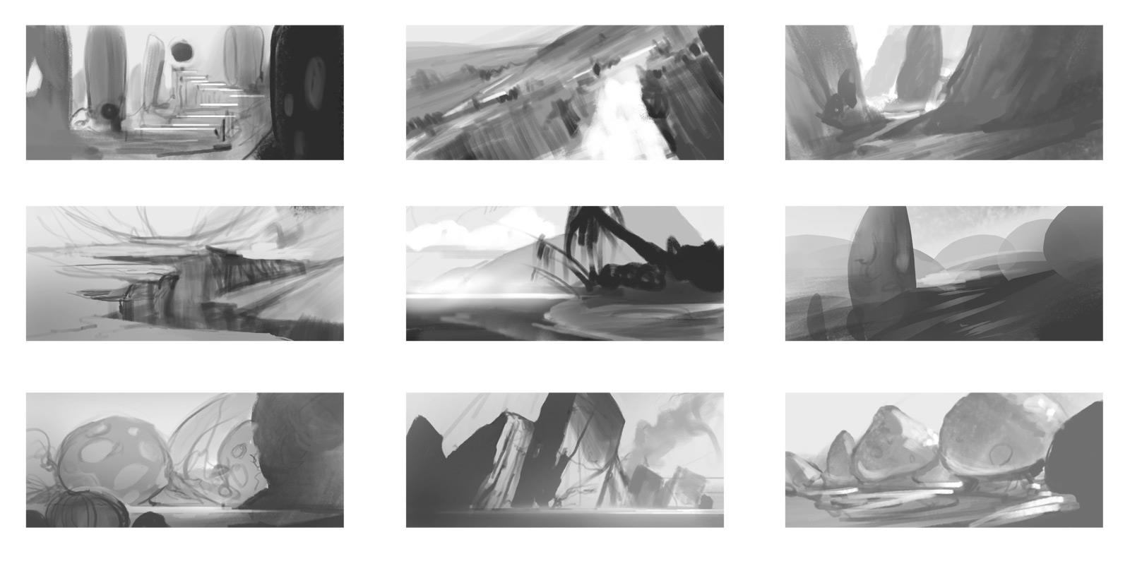
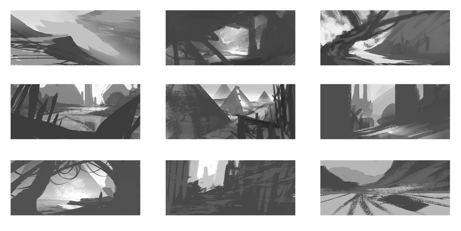
The more thumbnails, the better. It’s easier to tell if an image is working or not when it’s in its simplest form. These thumbs are also just to make sure that you have a strong shape language, that your silhouettes are reading, and/or the values are strong before you labor on a finished painting. The most famous example of the importance of shape language is the movie Up:
Each character had their own identity associated with a shape and this shape is concurrent throughout their figure, subtly or not. 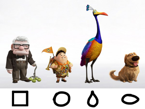
The bird for example has a teardrop shape (a large fat shape attached to skinny shape) and it appears in both the body and beak.
Here are examples in environment concept art:

Having a strong shape language helps make the environment feel unified, as if the monuments created by the same culture or the fauna belongs in that geography. Since we are concepting many types of environments, its important that each geo has its own distinction.
The last example shows that it’s possible to have two strong shapes present in an environment and still feel unified however be careful of putting too many. Here is an example of what I feel is an unsuccessful image because of a lack of shape language or too many shapes.
 - Circular spaceship thing.
- Imperfect vertical shapes of the rickety bridge.
- Perfectly parallel structure in the background.
- Snaky intertwining shapes of the vines.
The image falls apart because it doesn’t have a clear idea to convey.
If you’re not going to have recurrent shapes then keep your image very simple: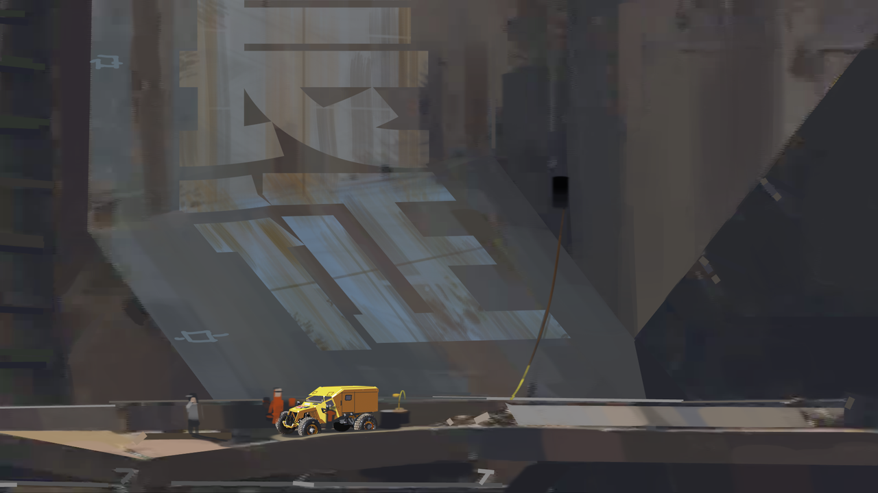
There is absolutely nothing wrong with a simple composition and rendering. In fact, sometimes the simplest concept are the strongest because they are the most clear. 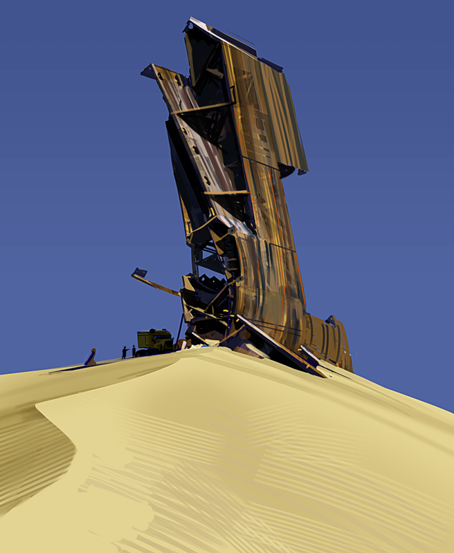
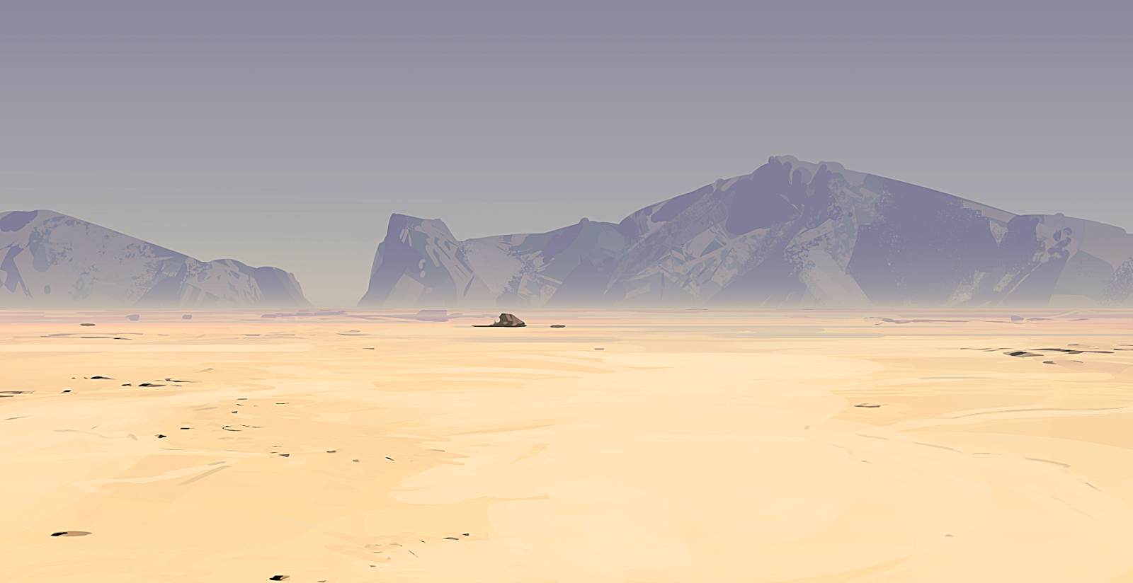
b. Feeling of Grandeur:
When a player plays the game, we want them to have a feeling of awe. One of the things that will help achieve this is a large mysterious architecture/organism looming near the player or far on the horizon.
Halo was apparently one of the first to do this.
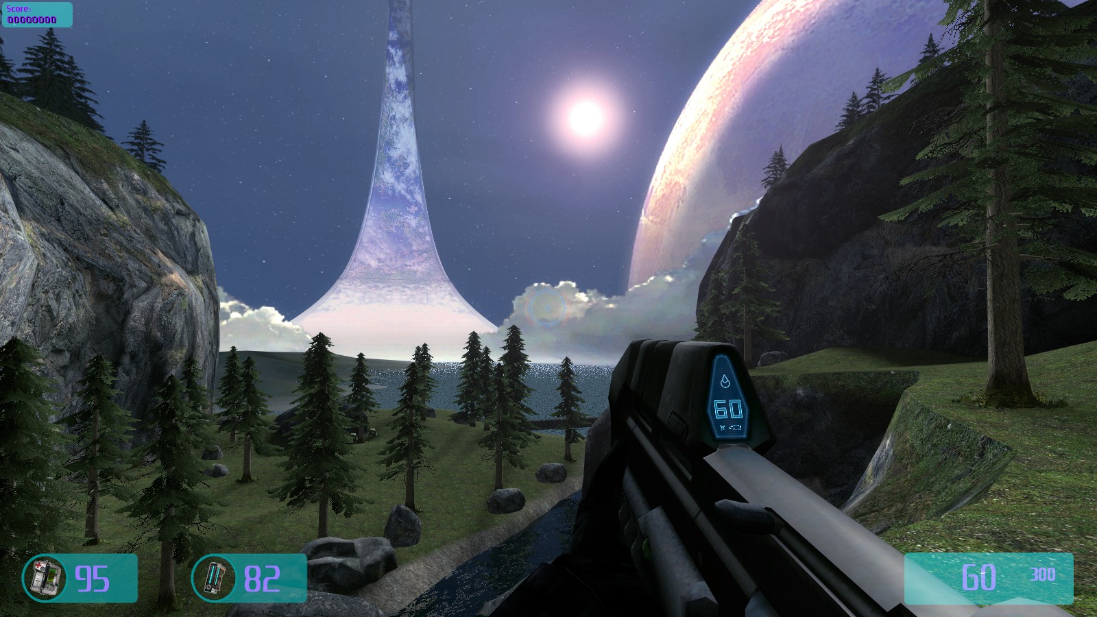
It really helps set a mood, that you’re a small thing in comparison the land around you.
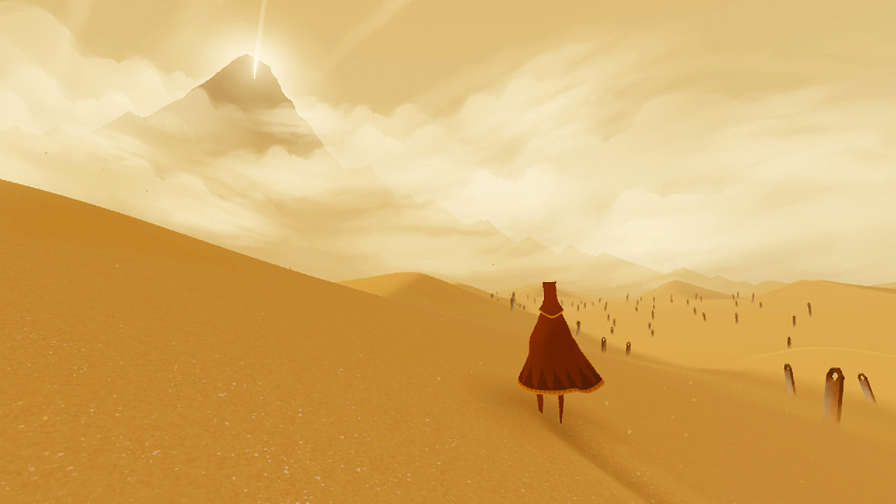
Another great example of this is the game Journey. Every so often in the game, you turn to look at the mysterious mountain. Your whole journey vaguely goes toward it.
Here’s that same example, but not in the distance:
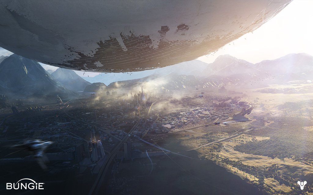
What helps sell that overwhelming feeling is the huge scale difference. The large giant white thing in comparison to the tiny tiny houses and buildings.
So, what do we need to think about when we try to concept this idea.
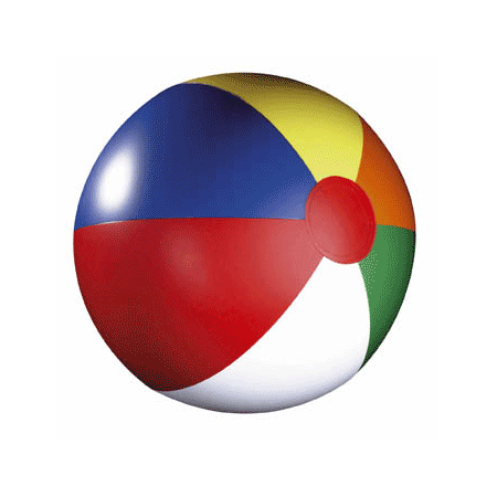
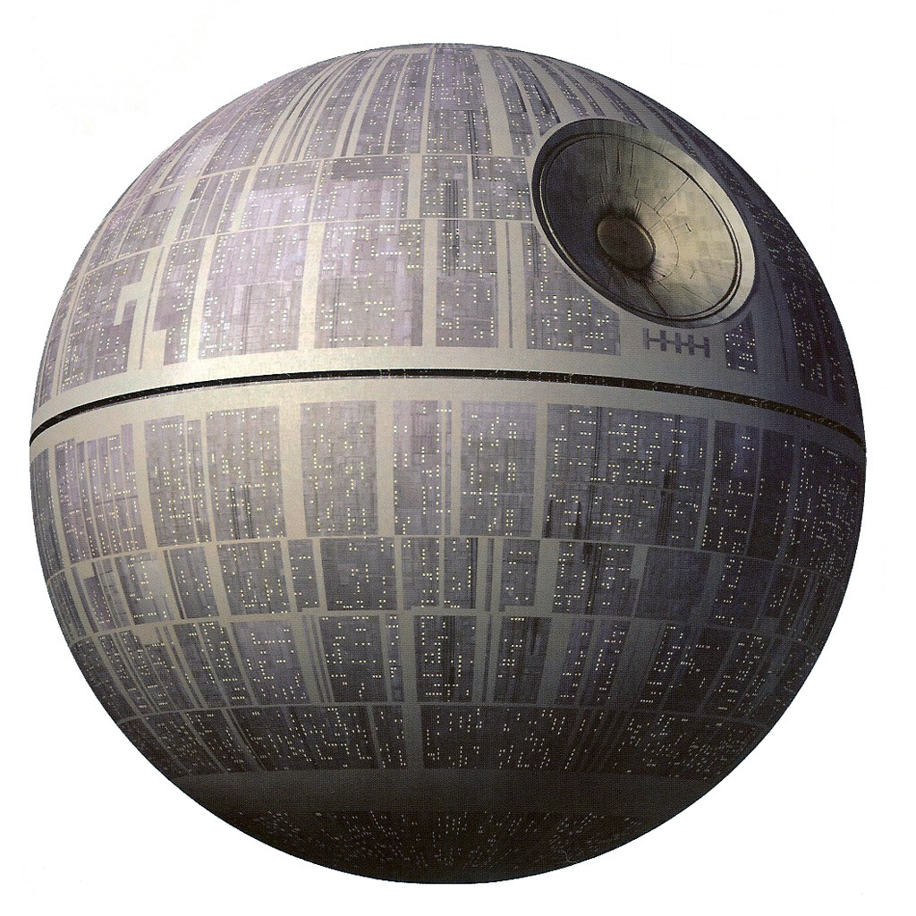
Well, how did they make the Death Star look so big?
Comparing the Death Star with this beach ball, it’s about context. The teeny tiny details on the Star helps make it feel huge. While the large shapes within the beach ball clearly make it small.
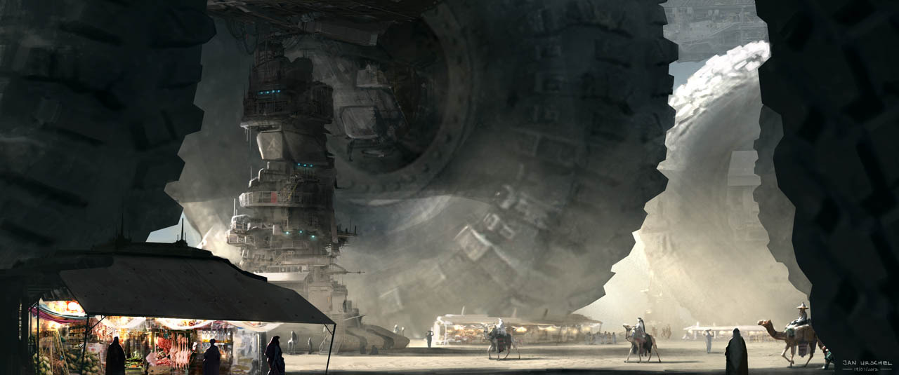
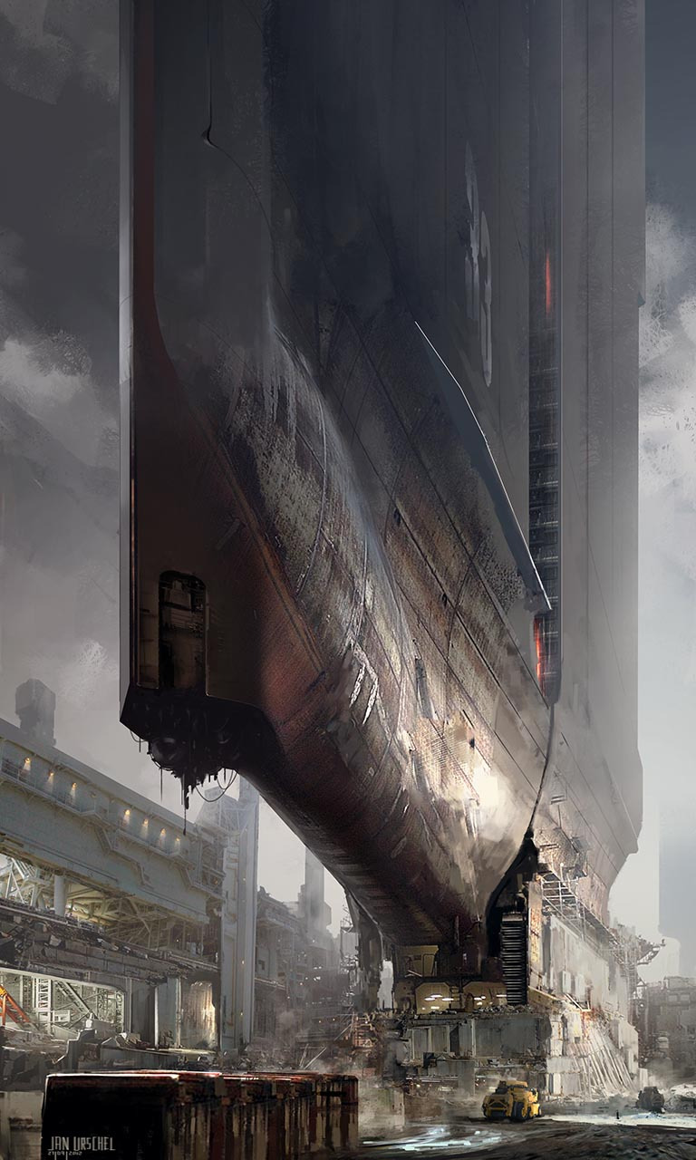
Some more examples:
c. Color:
LESS IS MORE!
There should really only be two to three main colors but keep it simple: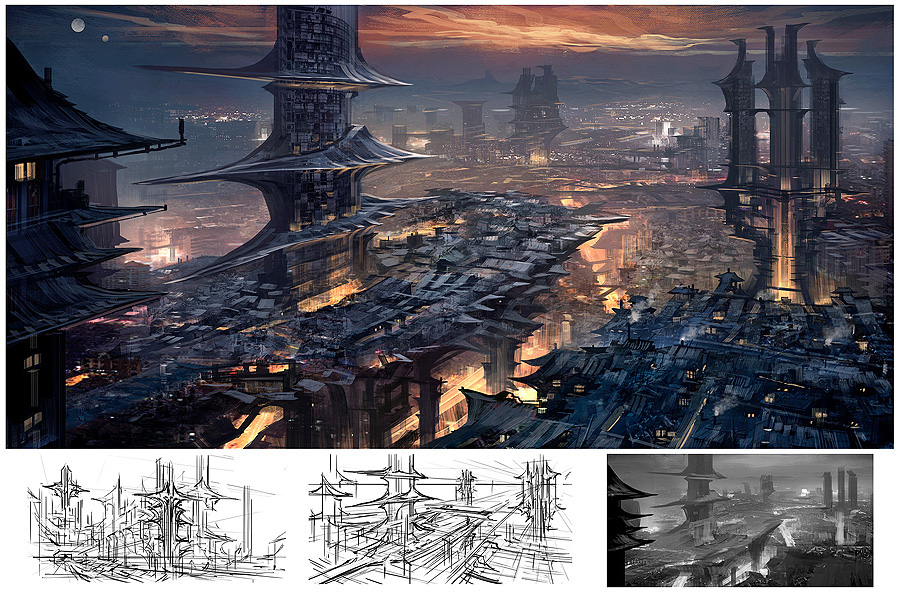
 For our game in particular, we want two main colors and a beauty spot color. The beauty spot adds life to the painting and usually helps attract the eye to the focal point.
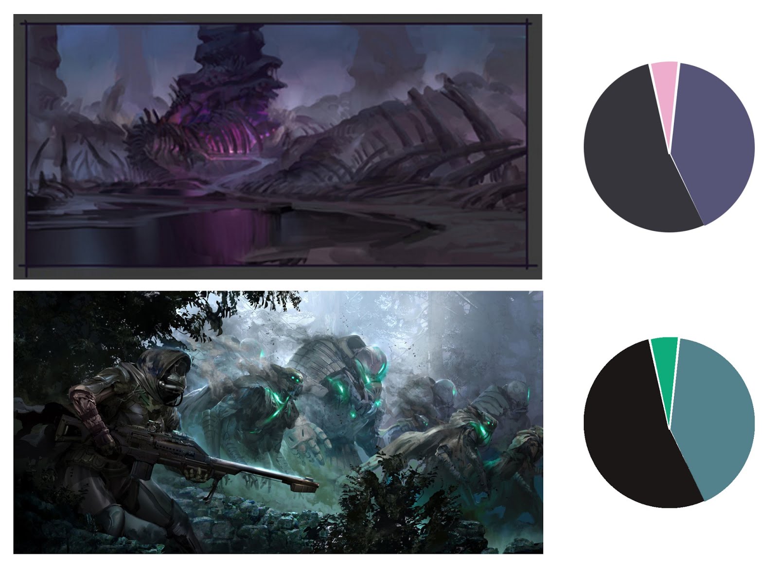
Here is an example of where I think too many colors are used and it makes the image convoluted.
The rendering is well done of course but I feel it’s not what we’re going for.
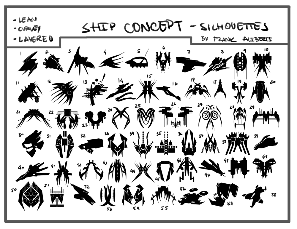
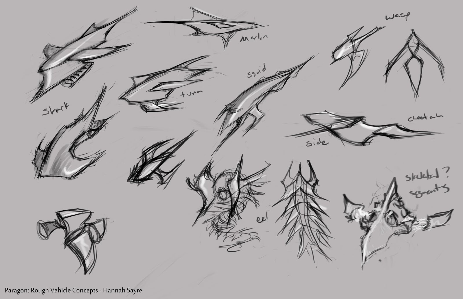
3. Ships
This section will talk about concepting and creating ship assets.
a. Shapes
Just like in environment concepting, shape language in ships are just as important. Is it hard or soft? Does it take inspiration from real-life organisms? Is it all hard except for the soft focal point?
In silhouettes, perhaps your first round is really about interesting shapes and patterns. However they eventually need to be instantly readable.
b. Color:
Just like in the environments, less is more for color. Mostly muted colors with the beauty spot color perhaps being the most saturated.